For starters, before you run to go search for sexy fonts on fontsly.com, you need to have a clear idea of the project you are starting in your mind: a light novel for young adults and the advertisement for your new extreme sports gym are not going to need the same kind of font. Not only that but knowing what type of project you are starting will help you select a typeface: the classes in which fonts are categorized to be able to identify them easier. There are 4 main types of type fonts: serif, sans serif, slab, and script, and every one of them has a different look and feel that will fit various types of projects.
SERIF:
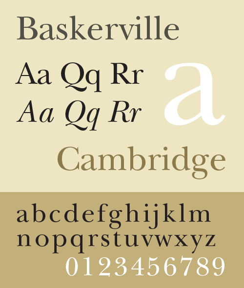
The name comes from the fact that they have little adornments or “serifs” at the end of each letter. An elegant, timeless, and very classy typeface. Use this typeface for long projects that need to be easy to read and somewhat formal and elegant: books, novels, essays, newspapers. Fonts that have a serif typeface are Baskerville, times new roman or century.
SANS SERIF:
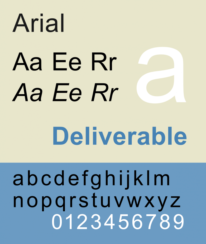
A reinvention of the serif typeface, they are much more formal, simple, cold, and devoid of ornaments. This typeface can be used for really serious things: business reports, bank statements, blogs versing about finance, or healthcare. Fonts with this typeface are Arial, Verdana, or the currently popular Proxima nova.
SLAB:
Bold, thick, masculine, aggressive, eye-catching. This typeface features very thick lettering with little adornments that will draw all the attention to it. Use this typeface for eye-catching, macho man, aggressive things like the logo for a new rugby gym, the advertisement for a new Jeep model, your fresh steak and whiskey speciality bar, or your shooting club. Use it in moderation! Slab typefaces are penultimate, Atomic, or Battle Sonic.
SCRIPT:
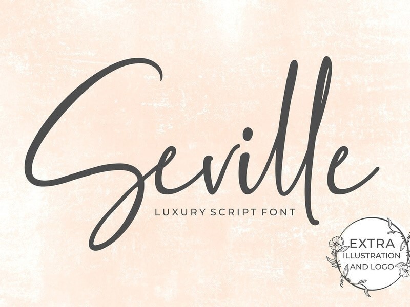
Round, cute and delicate, this ornate typeface tries to imitate all the curves and loops of human calligraphy! The most famous instance of it is the Disney font. Use this font for heartfelt love letters, a children’s book, the logo for your new cupcake shop, or an advertisement for your new cutesy fantasy clothing brand. Use in moderation! Script typefaces are salamander, Seville, or anaheim. Now that you know about typefaces, it’s time to decide which one your project needs. Is it something casual or formal? Heartfelt or professional? Ornate and elegant or cold and bold? Once you have a selected typeface, simply go to fonstly.com and start searching for fonts in your favourite category (disclaimer: the name of the fonts might include which typeface they are. or be completely random. Do not try to guide yourself by using the font name as they usually mean nothing.) Another thing you need to take into account is readability: you want your font to be easy to read, especially if it’s going to be a long project like an essay. Fonts that have high readability are those that help people with dyslexia or other disabilities read the text without problems. While some typefaces are considered more readable than others (most people agree that the serif typeface is the most easily readable one), usually typefaces and readability don’t go hand in hand. Some of the most readable fonts are Georgia, Helvetica, Verdana, and the widely scorned and joked about Comic Sans. You can choose a readable don’t without regard for the typeface, but if you do a bit of research, you will find readable fonts that you like in your preferred typeface too! All in all, choosing a font doesn’t have to be extremely difficult if you know what you are doing: have a clear idea of what you need in mind and half of the work will be done. We hope you’ve liked this article, and we hope you have learned more about fonts, typefaces, and their uses. If you have become irremediably interested in fonts, you can always find more fonts on fontsly.com! Thanks for reading techfollows.com.


